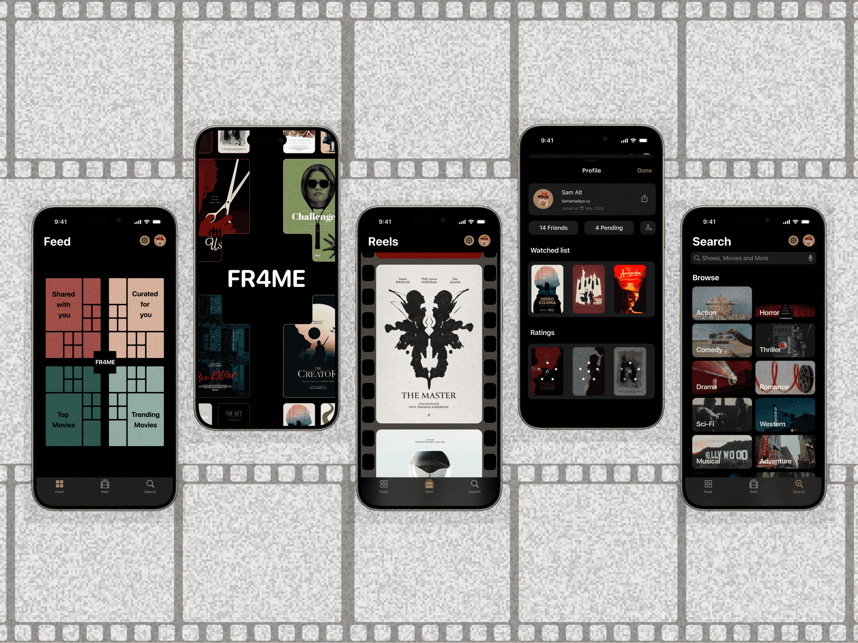
FR4ME
Reimagines movie browsing with a delightful bento box grid. Each compartment serves up a bite-sized overview of a film, showcasing its poster, title, and genre. Tap a tile to delve into a world of cinematic details, from captivating trailers to insightful reviews. Whether you're seeking a laugh-out-loud comedy or a heart-wrenching drama, FR4ME curates your movie marathon with effortless ease.
Client:
ADA
Role:
Lead Designer
Year:
2024
The Challenge
The FR4ME design faced several challenges:
Visual Appeal: Balancing the bento grid's aesthetic with clear information hierarchy.
Animation: Crafting a smooth, intuitive transition from overview to detail view.
Content Discovery: Creating an engaging way to browse and discover new films within the reels.
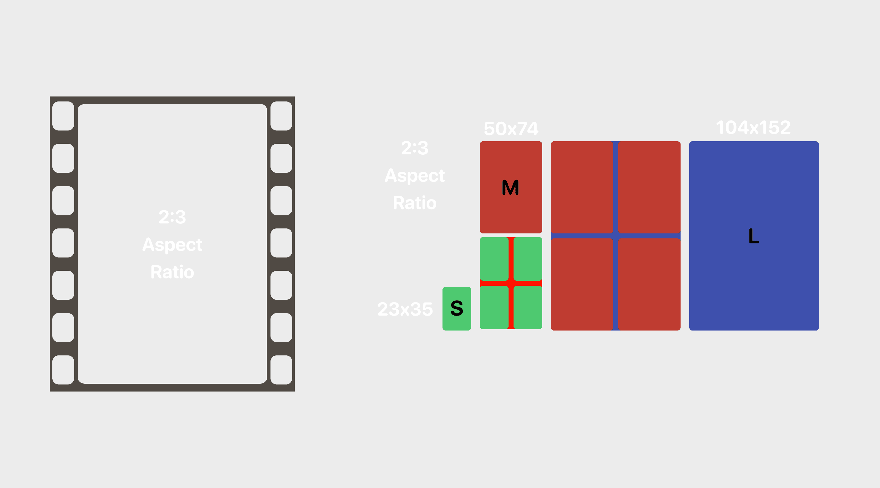
Responsiveness: Ensuring the app adapts seamlessly to various screen sizes and aspect ratios, particularly the 2:3 format.
Process
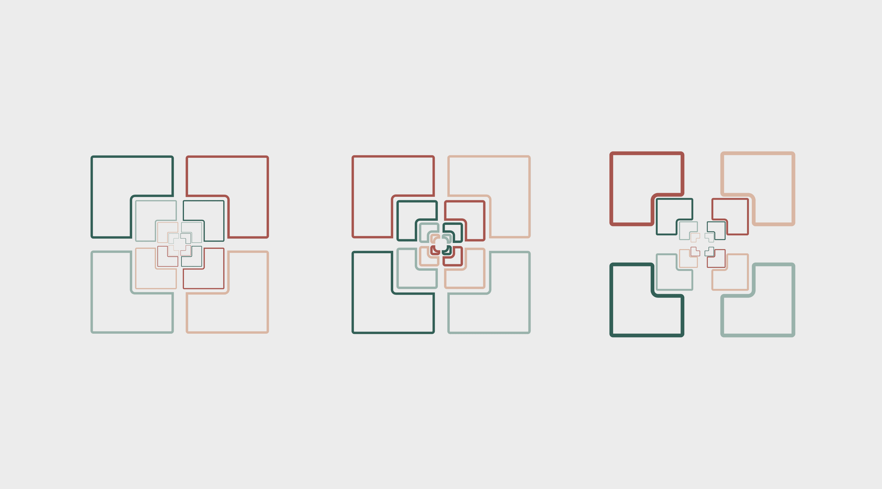
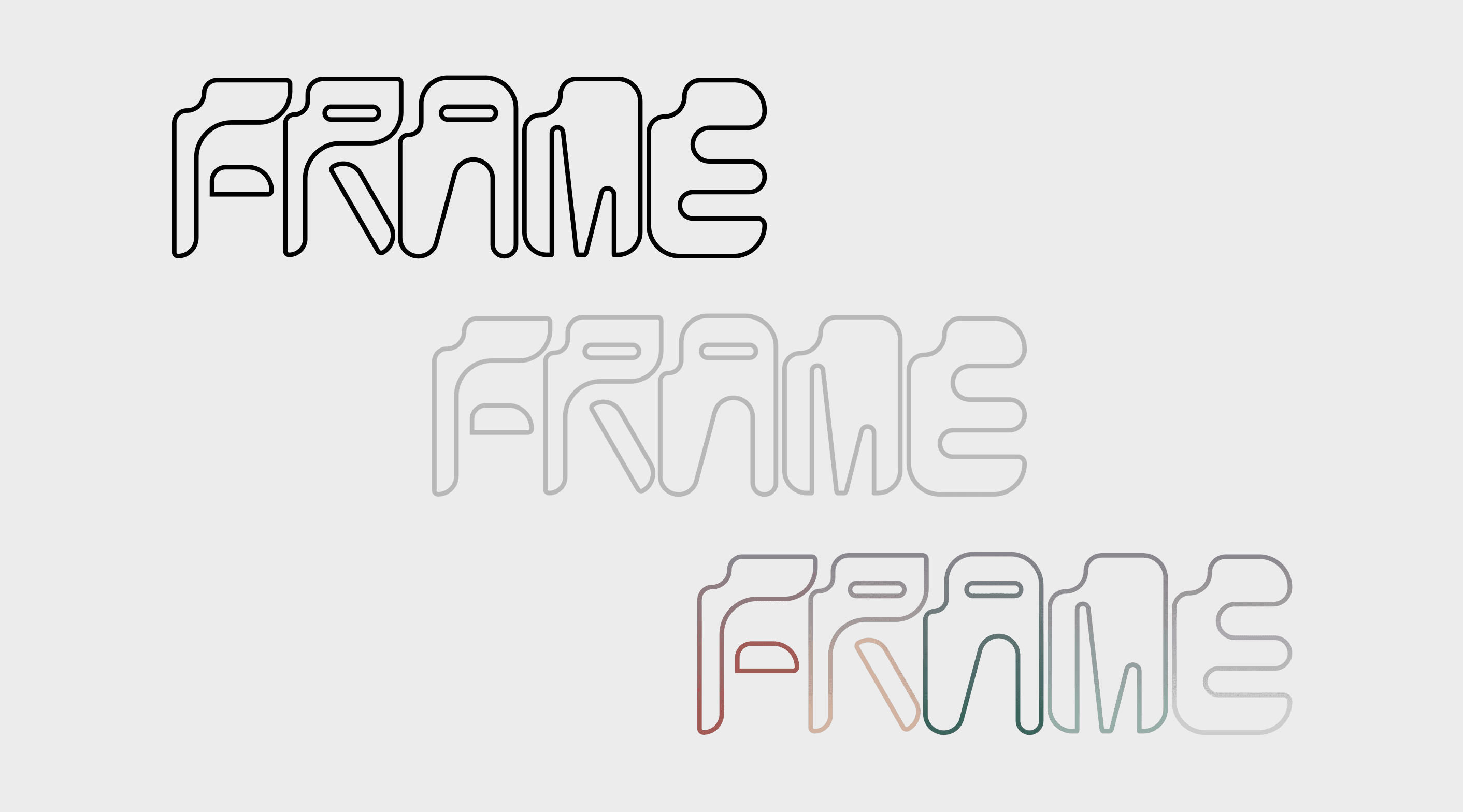
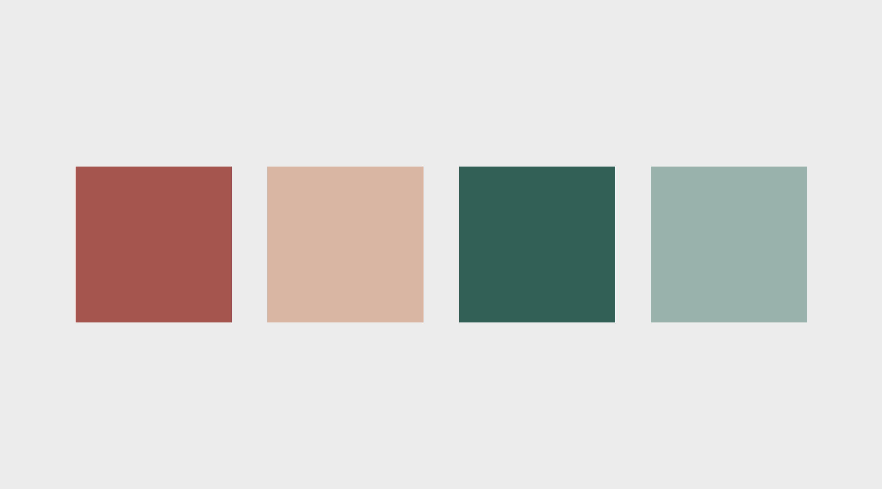
Icon and Logo Design: The FR4ME logo and icon embody the bento box concept in a playful and memorable way. The logo features a stylized bento box overflowing with popcorn, playfully referencing the app's movie focus. The icon takes a more minimalist approach, using a stack of squares to represent the bento grid system, with a subtle film reel element incorporated to hint at the app's function.
Typography: A modern, cinematic typeface was chosen to complement the overall design aesthetic. The typeface strikes a balance between readability and personality, ensuring that movie titles and other information are easy to digest while still maintaining a stylish flair that reflects the app's focus on film.
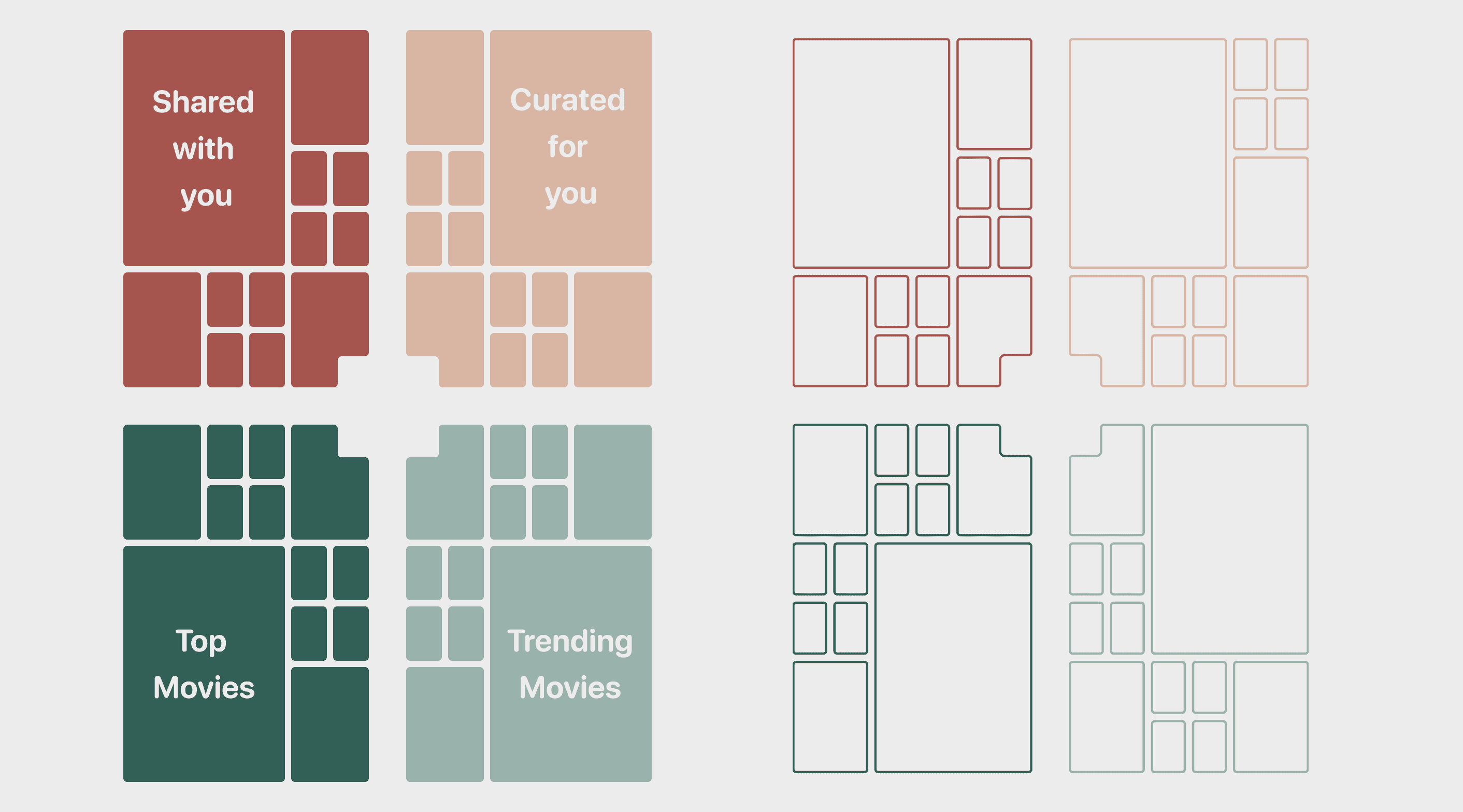
Bento Grid Formulation: Extensive prototyping explored different grid configurations to optimize the bento grid for both information display and visual appeal. The 2:3 aspect ratio presented a unique challenge, but also an opportunity to create a distinctive user experience. Iterations explored square grids, asymmetrical layouts, and even hexagonal configurations. Ultimately, a rectangular grid with a 3:2 aspect ratio for each compartment was chosen, as it provided a good balance between showcasing movie posters and displaying essential details like title and genre. This layout also lent itself well to the 2:3 aspect ratio, minimizing wasted space and ensuring a clean, uncluttered aesthetic.
Animation Refinement: The transition animation between the overview grid and the detailed movie view was meticulously crafted to balance speed, fluidity, and visual impact. Early iterations explored simple zoom-in effects, but these lacked the playful charm that the FR4ME team was aiming for. The final animation incorporates a subtle bento box opening effect, where the tapped tile pops open like a compartment, revealing the movie details within. This animation adds a delightful layer of interactivity and reinforces the app's core visual metaphor.
Solution
FR4ME successfully combines the bento aesthetic with intuitive navigation and content discovery. The grid's adaptability to the 2:3 ratio offers a unique visual experience, and the animated transitions enhance the feeling of immersion. The endless reels provide a delightful way to stumble upon new films, while the search function caters to those who know exactly what they want.
Key takeaways
Visual Metaphors: Leveraging a strong visual metaphor (the bento box) can create a memorable and engaging user experience.
Animation as Storytelling: Thoughtful animation can transform navigation into a delightful narrative element.
Adaptive Layouts: Embrace the constraints of different screen sizes and aspect ratios to create unique and functional design solutions.
Prototype